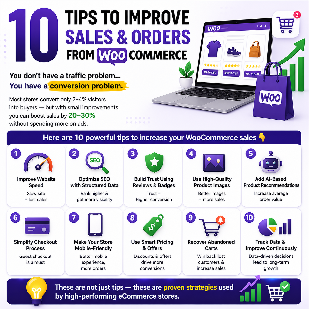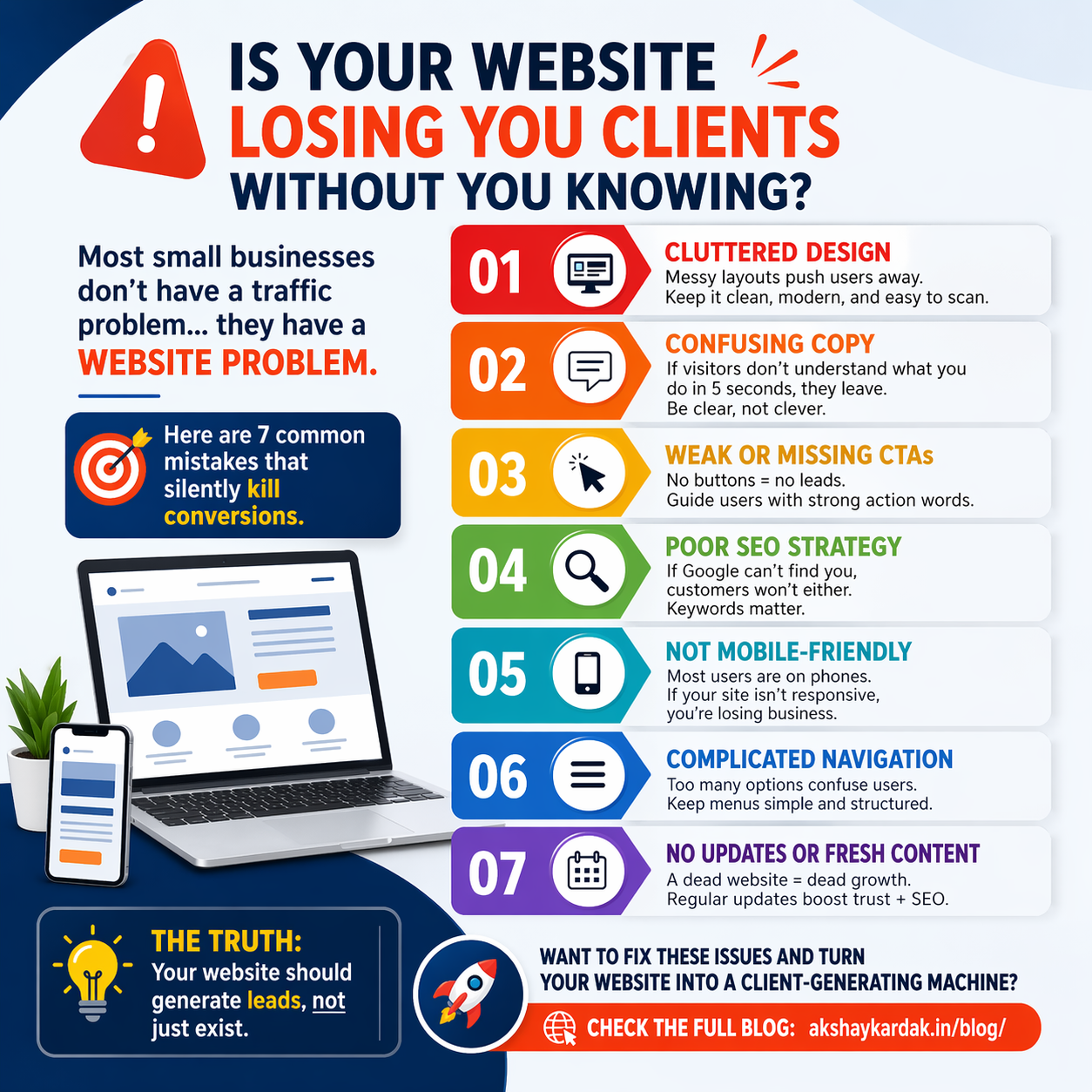
7 Common Website Mistakes Small Businesses Make (and How to Fix Them)
Executive Summary: Your website is your 24/7 salesman. Yet many small businesses unknowingly drive prospects away by making simple mistakes. In this article, we’ll expose seven common website mistakes and explain how each one hurts your business (from lost leads to poor search rankings). Most importantly, we’ll show step-by-step fixes to turn your site into a lead-generating machine.
| Mistake | Impact on Business | Fix |
| 1. Boring or cluttered design | High bounce rate; poor first impression | Clean, engaging layout with images and whitespace |
| 2. Unclear or “clever” copy | Visitors confused; key message lost | Use clear headlines: Who are you? What you do? |
| 3. Missing/weak CTAs | Traffic but no leads (money left on table) | Add prominent, action-oriented buttons everywhere |
| 4. Poor SEO (no keyword strategy) | Site invisible in Google; low organic traffic | Do keyword research, optimize meta tags and content |
| 5. Not mobile-friendly | Mobile visitors leave; lost sales | Use responsive design; test on phones/tablets |
| 6. Confusing navigation | Users get lost; low engagement | Simplify menus (7 items max); use clear labels |
| 7. No fresh content/updates | Website “stale”; no repeat visits or SEO benefits | Start a blog; update site regularly; maintenance |
1. Boring or Cluttered Design
A dull, unformatted page instantly loses visitor interest. A cluttered homepage (think too many images, blinking banners, or illegible fonts) overwhelms users. This erodes trust and credibility. Even if your content is good, bad design makes people leave quickly.
Why it hurts: High bounce rates and low engagement mean missed sales. Users judge credibility in seconds; an amateurish or busy layout sends them away.
How to fix it: * Use whitespace and hierarchy.
Choose a clean template.
Invest in visuals.
Perform a mobile check.
Lead-capture tip: On each page, add an inviting CTA (e.g. “Contact us” or “Get a Quote”) in a button that stands out from the design.
2. Unclear or “Clever” Copy
Your homepage (and every page) must immediately answer: Who are you? What do you do? and Why should I care? Sacrificing clarity for clever wording risks losing visitors fast. The page above the fold should instantly explain your value in simple language.
Why it hurts: If visitors can’t understand your offer in 5 seconds, they leave. Clear copy builds trust; confusing copy drives users away.
How to fix it: * Be direct with bold headlines.
Speak their language (avoid jargon).
Explain benefits.
Use short sentences.
Edit ruthlessly.
CTA placement: Right after a clear headline or opening paragraph, include a call-to-action like “Schedule a Free Consultation.”
3. Missing or Weak Calls-to-Action (CTAs)
Even if visitors love your site and understand your offer, they won’t become customers unless you ask them. Many small-business sites bury their only CTA behind “Contact” in the menu, which is too subtle. Without obvious next steps, traffic won’t convert.
Why it hurts: Visitors may leave wondering “What now?” instead of calling or signing up. Failing to add a prominent CTA on each page is literally leaving money on the table.
How to fix it: * Add buttons or links after every section.
Use clear action words (e.g., “Download our Free Guide”).
Highlight CTAs with contrasting colors.
Reduce choice to one main action per section.
Lead-capture tip: Use lead magnets like free ebooks or checklists in exchange for email addresses.
4. Poor SEO (No Keyword Strategy)
If customers can’t find you on Google, even a perfect website won’t generate business. You must explicitly optimize your pages for the terms potential clients use, or you’ll rank low.
Why it hurts: Low Google rankings mean almost zero organic traffic. Instead of free leads, you rely on paid ads or referrals only.
How to fix it: * Conduct keyword research.
Optimize on-page SEO (titles, meta descriptions, headings).
Optimize images with alt text.
Improve speed and structure.
Build backlinks and citations.
SEO tip: Launch a blog to create regular, keyword-rich articles that improve rankings.
5. Not Mobile-Friendly
Over half of web traffic now comes from smartphones. A site that only looks good on desktop is doomed. Mobile-friendly design means reflowing menus, images, and buttons for ease of use on phones.
Why it hurts: Google prioritizes mobile-first indexing. If a visitor on a phone sees tiny text or has to pinch-zoom, they’ll click away.
How to fix it: * Use a responsive theme.
Test on real devices.
Simplify the mobile layout (hamburger menus).
Prioritize loading speed.
Avoid Flash and pop-ups.
Conversion tip: Make sure your phone number is clickable (“tap to call”) on the header or footer.
7 Common Website Mistakes Small Businesses Make (and How to Fix Them)
Executive Summary: Your website is your 24/7 salesman. Yet many small businesses unknowingly drive prospects away by making simple mistakes. In this article, we’ll expose seven common website mistakes and explain how each one hurts your business (from lost leads to poor search rankings). Most importantly, we’ll show step-by-step fixes to turn your site into a lead-generating machine.
Quick Overview: Mistakes, Impacts, and Fixes
| Mistake | Impact on Business | Fix |
| 1. Boring or cluttered design | High bounce rate; poor first impression | Clean, engaging layout with images and whitespace |
| 2. Unclear or “clever” copy | Visitors confused; key message lost | Use clear headlines: Who are you? What you do? |
| 3. Missing/weak CTAs | Traffic but no leads (money left on table) | Add prominent, action-oriented buttons everywhere |
| 4. Poor SEO (no keyword strategy) | Site invisible in Google; low organic traffic | Do keyword research, optimize meta tags and content |
| 5. Not mobile-friendly | Mobile visitors leave; lost sales | Use responsive design; test on phones/tablets |
| 6. Confusing navigation | Users get lost; low engagement | Simplify menus (7 items max); use clear labels |
| 7. No fresh content/updates | Website “stale”; no repeat visits or SEO benefits | Start a blog; update site regularly; maintenance |
1. Boring or Cluttered Design
A dull, unformatted page instantly loses visitor interest. A cluttered homepage (think too many images, blinking banners, or illegible fonts) overwhelms users. This erodes trust and credibility. Even if your content is good, bad design makes people leave quickly.
Why it hurts: High bounce rates and low engagement mean missed sales. Users judge credibility in seconds; an amateurish or busy layout sends them away.
How to fix it: * Use whitespace and hierarchy.
Choose a clean template.
Invest in visuals.
Perform a mobile check.
Lead-capture tip: On each page, add an inviting CTA (e.g. “Contact us” or “Get a Quote”) in a button that stands out from the design.
2. Unclear or “Clever” Copy
Your homepage (and every page) must immediately answer: Who are you? What do you do? and Why should I care? Sacrificing clarity for clever wording risks losing visitors fast. The page above the fold should instantly explain your value in simple language.
Why it hurts: If visitors can’t understand your offer in 5 seconds, they leave. Clear copy builds trust; confusing copy drives users away.
How to fix it: * Be direct with bold headlines.
Speak their language (avoid jargon).
Explain benefits.
Use short sentences.
Edit ruthlessly.
CTA placement: Right after a clear headline or opening paragraph, include a call-to-action like “Schedule a Free Consultation.”
3. Missing or Weak Calls-to-Action (CTAs)
Even if visitors love your site and understand your offer, they won’t become customers unless you ask them. Many small-business sites bury their only CTA behind “Contact” in the menu, which is too subtle. Without obvious next steps, traffic won’t convert.
Why it hurts: Visitors may leave wondering “What now?” instead of calling or signing up. Failing to add a prominent CTA on each page is literally leaving money on the table.
How to fix it: * Add buttons or links after every section.
Use clear action words (e.g., “Download our Free Guide”).
Highlight CTAs with contrasting colors.
Reduce choice to one main action per section.
Lead-capture tip: Use lead magnets like free ebooks or checklists in exchange for email addresses.
4. Poor SEO (No Keyword Strategy)
If customers can’t find you on Google, even a perfect website won’t generate business. You must explicitly optimize your pages for the terms potential clients use, or you’ll rank low.
Why it hurts: Low Google rankings mean almost zero organic traffic. Instead of free leads, you rely on paid ads or referrals only.
How to fix it: * Conduct keyword research.
Optimize on-page SEO (titles, meta descriptions, headings).
Optimize images with alt text.
Improve speed and structure.
Build backlinks and citations.
SEO tip: Launch a blog to create regular, keyword-rich articles that improve rankings.
5. Not Mobile-Friendly
Over half of web traffic now comes from smartphones. A site that only looks good on desktop is doomed. Mobile-friendly design means reflowing menus, images, and buttons for ease of use on phones.
Why it hurts: Google prioritizes mobile-first indexing. If a visitor on a phone sees tiny text or has to pinch-zoom, they’ll click away.
How to fix it: * Use a responsive theme.
Test on real devices.
Simplify the mobile layout (hamburger menus).
Prioritize loading speed.
Avoid Flash and pop-ups.
Conversion tip: Make sure your phone number is clickable (“tap to call”) on the header or footer.
6. Confusing Navigation
Your navigation menu is the roadmap for users. Too many menu items or unclear labels cause confusion. If it’s too long or missing key links, visitors will bail.
Why it hurts: Poor navigation means users give up finding the info they need. It also hurts SEO, because search engines see a site structure in your menu.
How to fix it: * Limit menu items to 5–7 top-level links.
Use clear labels like “Services” and “About.”
Add search and footer links.
Optimize the mobile menu.
Test the user flow.
UX tip: On each page, have at least one link or button guiding to the next logical step.
7. No Fresh Content or Updates
A static “brochure” website that never changes is a major missed opportunity. Without new content, you lack landing pages for specific search queries and reasons for visitors to return.
Why it hurts: No blog = no SEO juice. A stale site also erodes trust; visitors may wonder if the business still exists.
How to fix it: * Start a blog or news page.
Update products and testimonials regularly.
Use an email list to drive return visits.
Invest in technical website support.
Add trust signals like awards or client logos.
Lead-capture tip: In your blog sidebar, embed an email signup form to turn visitors into prospects over time.
Implementation Checklist
Audit Your Site: Identify slow load times, mobile errors, and broken links.
Improve Design & Copy: Use the 3-second rule for clarity.
Set Up SEO Basics: Research 5–10 keywords and update meta data.
Make It Mobile-Friendly: Switch to a responsive theme and touch-test forms.
Simplify Navigation: Trim the menu to 5–7 items.
Add/Refresh CTAs: Ensure every page has a strong action button.
Start a Blog: Plan to publish at least monthly.
Monitor & Iterate: Track data via Google Analytics and adjust accordingly.
Need help fixing your website? I’m Akshay Kardak, a freelance web developer and SEO specialist. I help small businesses turn their sites into lead-generating machines.
My Services: WordPress & Elementor Development · Responsive Design · SEO Optimization · E-commerce Setup · Conversion-Focused Copywriting
Take Action: Contact me today for a free consultation and quote.